A web redesign spanning across multiple enterprises of the Wiener Stadtwerke
With 16,100 employees, the Wiener Stadtwerke concern is one of the 25 largest companies in Austria and contributes significantly to keep the city of Vienna running smoothly. Wiener Stadtwerke generates annual sales revenues of almost three billion euros with the group divisions of energy, mobility, parking, funerals, and cemeteries.
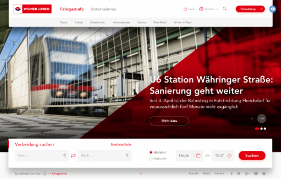
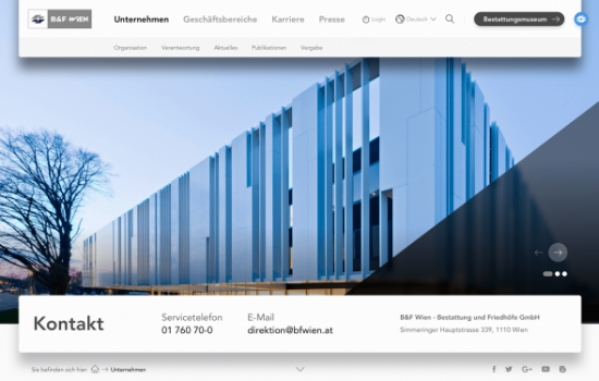
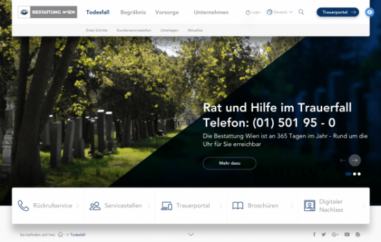
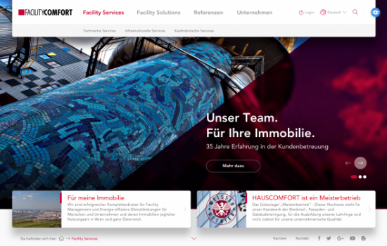
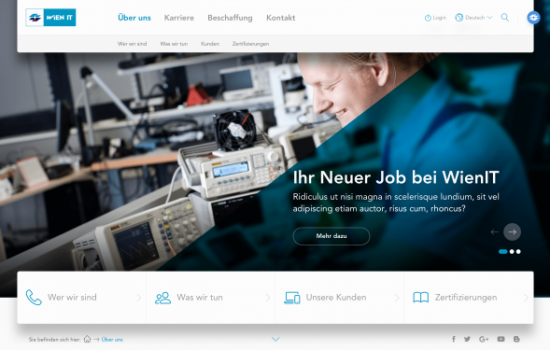
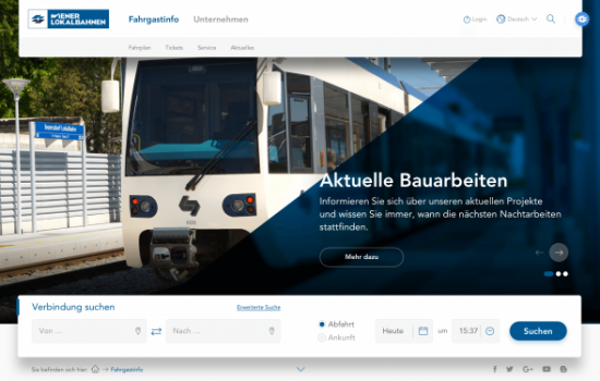
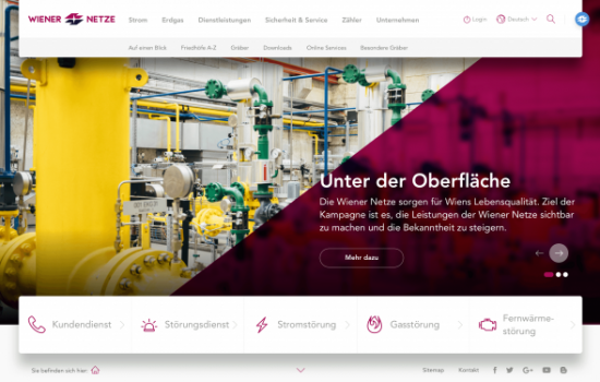
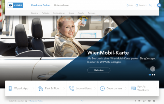
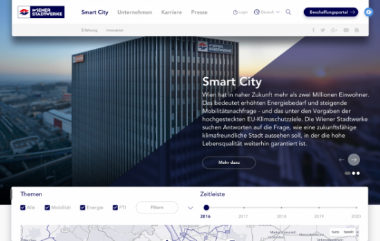
During the redesign process, we concentrated on a redesign of the site and its elements due to the given information structures and content. The design is marked by its straightforwardness and avoids unnecessary playfulness without losing any of its character.
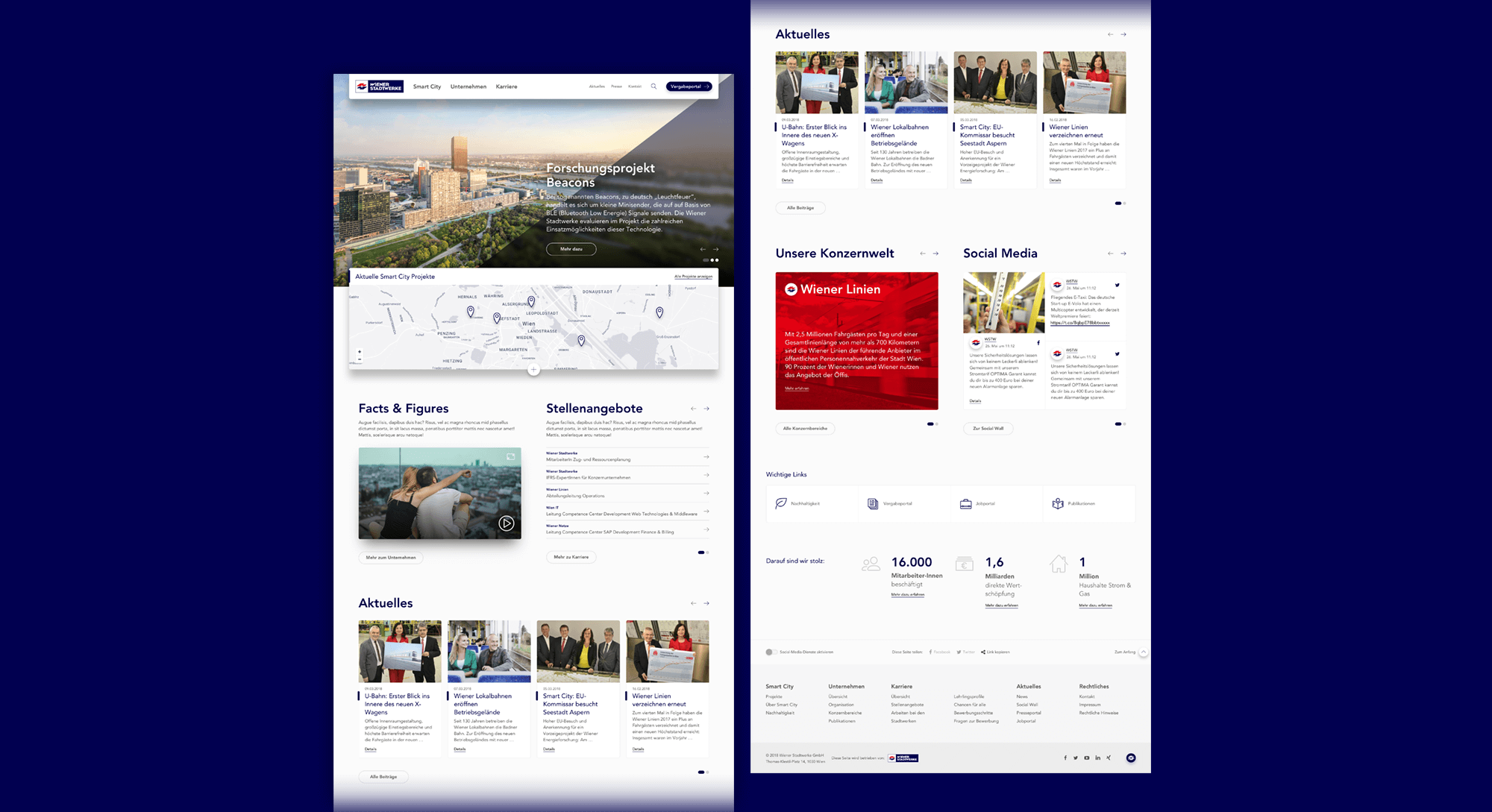
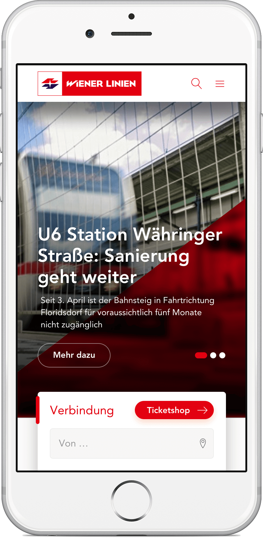
The background image or video covers the entire width of the screen. You can switch between the individual slides using the arrow navigation (or drag/swipe). The triangle is animated when building the page or changing the slides and reflects the dynamic importance of the Wiener Stadtwerke for the city of Vienna, including its corporations. The city is always on the move, as is Vienna’s largest service provider. In addition, this element serves us as a visual bracket across all corporate pages and as a calming surface for teaser texts.
We gave the design more freedom and depth, and partly disrupted symmetries and the linear representation by using e.g. the 36° angle of the signet as an overlapping element for the triangle in the respective color.
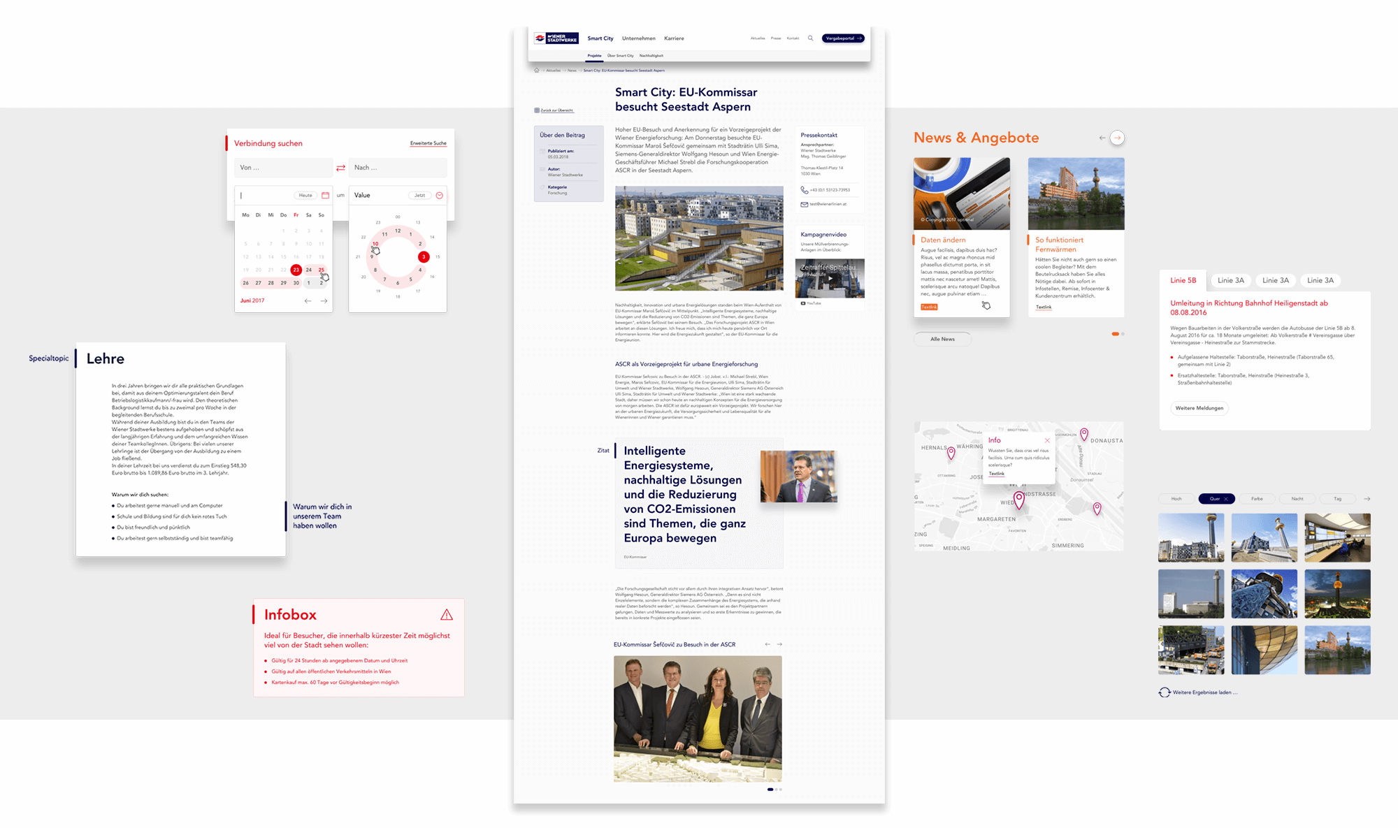
In the central content area, which is kept narrow due to its low barrier width, we show examples of the most diverse content elements that can be used in a modular and arbitrary manner in a building block system. This includes text, image and video elements, tables, tabs, widgets, accordions, info boxes, quotes, galleries, thematic focuses, teasers in various sizes and use cases as well as maps and tooltips.
Microsites, Applications & Co
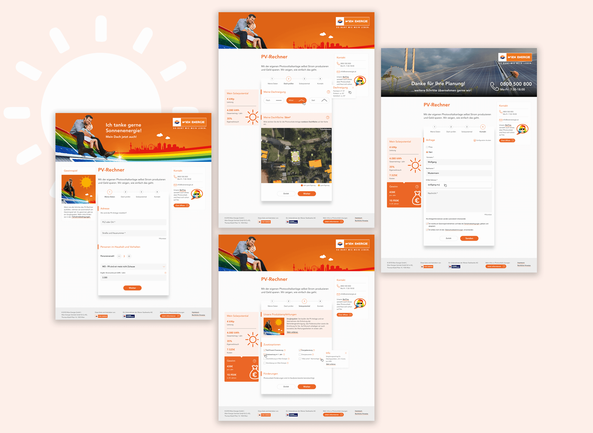
The basic design called for a structure that is as flexible as possible, which meets the most diverse requirements (e.g. microsites with advertising character, campaign sites, interactive applications, appearances with a service or information focus).
Example: photovoltaic calculator, Wien Energie
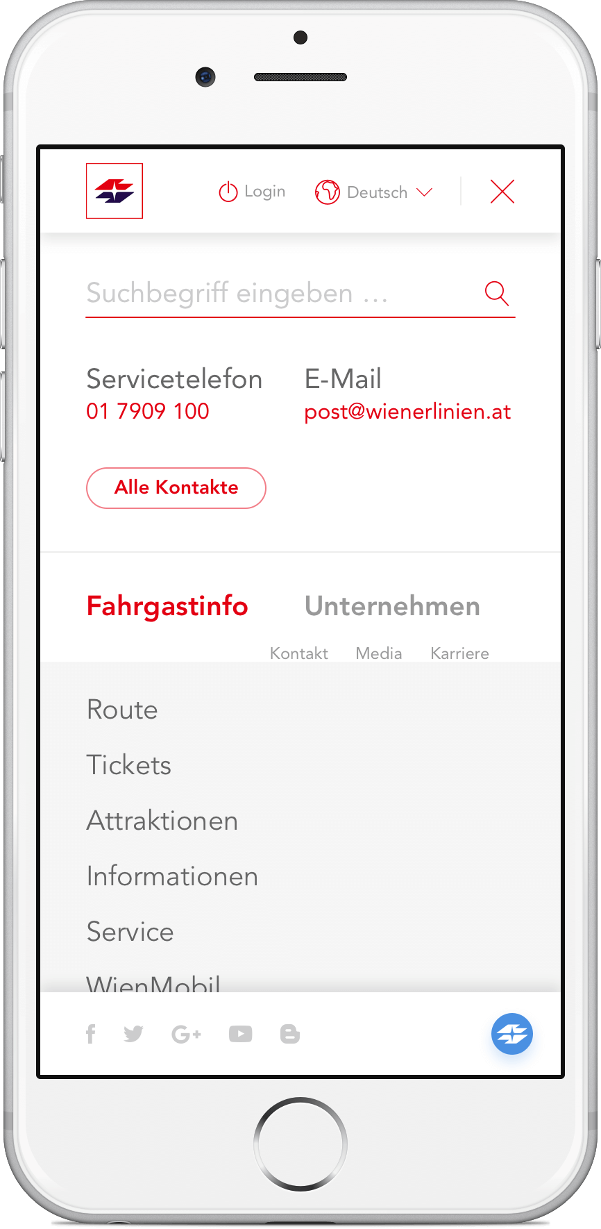
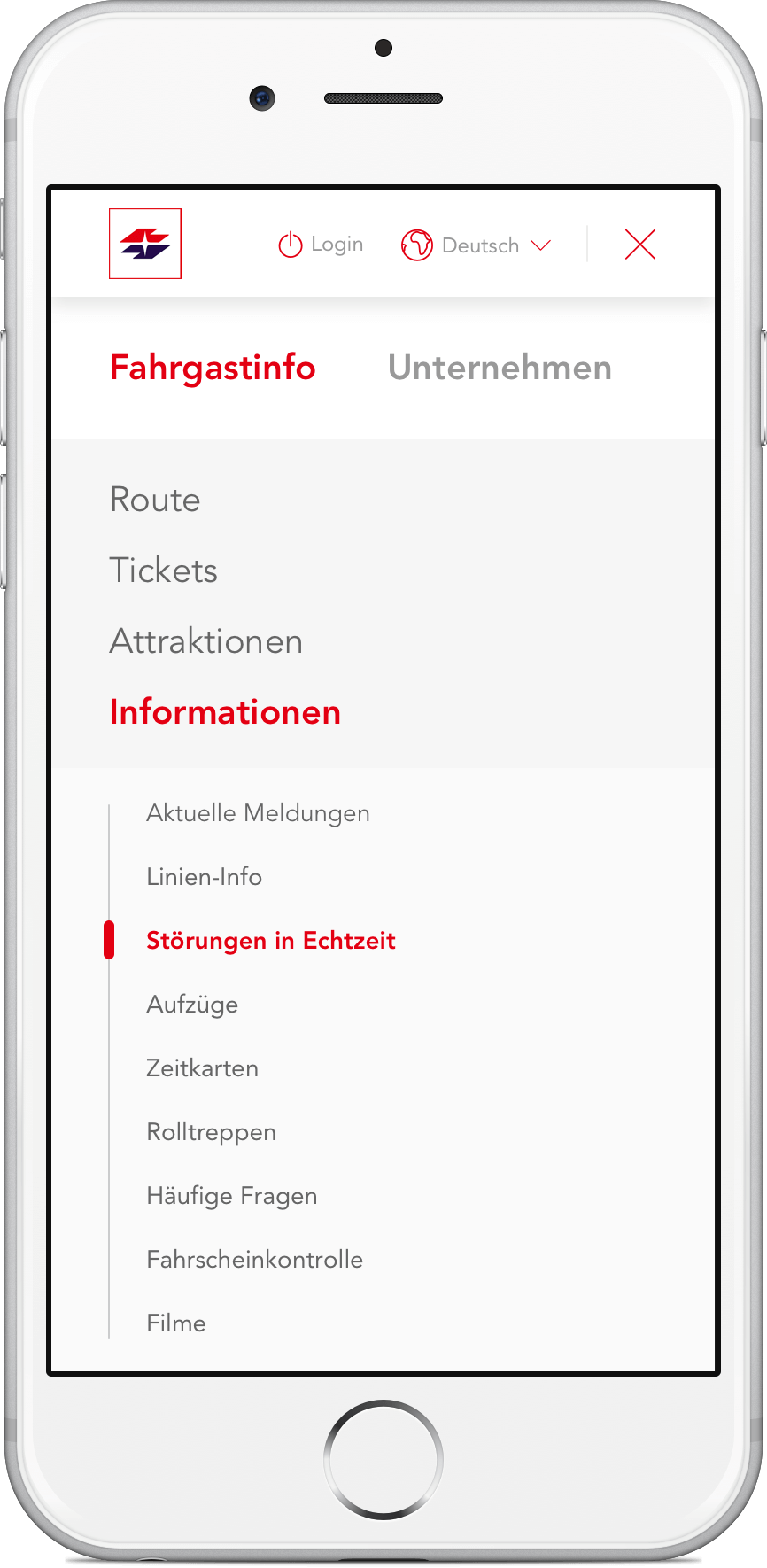
Responsive design with mobile navigation.
